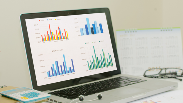
Ever felt confused about when to use a histogram versus a bar graph? They may look similar, but each one tells a different story. Knowing which to choose can make your data easier to understand. Let’s break down the difference between a histogram and a bar graph in simple terms and with some real-life examples.
What is a Histogram?
A histogram is like grouping numbers into buckets and counting how many fit in each bucket. Think of it as sorting your closet by sizes instead of individual pieces. If you look at your clothes by small, medium, and large, a histogram could show you how many items fall into each size range.
Histograms work best with continuous data—data that falls along a range without fixed categories. For example, let’s say you have the ages of people in a class, and you want to see how many people are in each age range. You’d group ages into intervals like 10-15, 16-20, and 21-25. When you graph it, each range has a bar, and the bars touch because there’s no gap in ages. This helps show how the ages spread across different ranges.
Real-Life Example: Imagine you want to see the range of heights in your family. You group heights by ranges like 4-5 feet, 5-6 feet, and so on. A histogram would show how many family members fall within each height range.
What is a Bar Graph?
A bar graph is used for separate categories, where the bars don’t touch because each category stands alone. If a histogram is your closet sorted by size, a bar graph is like sorting it by types of clothing—shirts, pants, jackets, etc. The space between bars highlights that each item is different.
Bar graphs are perfect for categorical data—things you can put into clear groups. For example, if you’re comparing your family’s favorite fruits (like apples, bananas, and oranges), each fruit is a separate category. You’d use a bar graph to see how popular each fruit is in your family, with each fruit having its own bar, separated by a space.
Histogram vs Bar Graph: Key Differences Explained in Simple Terms
| Aspect | Histogram | Bar Graph |
| Purpose | Shows distribution of data across ranges or intervals. | Compares different categories or groups. |
| Data Type | Continuous data (data that flows in a range, like age, height, or time). | Categorical data (distinct groups, like favorite sports or fruit types). |
| Bar Spacing | Bars touch each other, as they represent a continuous flow of data. | Bars have spaces between them, showing each category is separate and distinct. |
| Example Data | Ages of people grouped by ranges (0-10, 11-20, 21-30, etc.). | Favorite sports in a classroom (soccer, basketball, baseball, etc.). |
| Real-Life Example | Measuring heights in a family, grouped by ranges (e.g., 4-5 feet, 5-6 feet). | Poll of kids’ favorite sports in class: soccer, basketball, and baseball, with each sport shown separately. |
| Best Used For | Showing patterns or trends within a range, like scores on a test. | Comparing quantities across distinct categories, like number of kids in each sports preference. |
Real-Life Example:
Imagine a classroom poll asking kids their favorite sport: soccer, basketball, or baseball. A bar graph would display each sport as a separate bar with spaces in between, showing how many kids like each one. The gaps indicate that these categories (sports) are not connected, making it easy to see preferences at a glance.
Histogram vs Bar Chart: Spotting the Difference
Here’s a simple way to remember the difference between a bar graph and histogram:
- Data Type: Use histograms for ranges (like ages or heights) and bar graphs for individual categories (like fruit types or favorite sports).
- Bars Touch vs. Separate: In histograms, bars touch because the data flows from one range to another. In bar graphs, bars have spaces between them to show each category is unique.
- Purpose: Histograms show the distribution of data over intervals; bar graphs display counts for separate categories.
When to Use a Bar Graph vs Histogram?
Now, let’s clarify when to use a bar graph vs histogram:
- Use a histogram when you have a range of values and want to see how data falls within intervals. For example, if you’re looking at the scores from a math test, you can see how many students scored between 60-70, 70-80, and so on.
- Use a bar graph when you’re dealing with separate groups or categories. For instance, if you want to show how many students prefer different ice cream flavors, each flavor is its own category, making a bar graph ideal.
Conclusion
To sum up, a histogram is not the same as a bar graph—each has its own purpose. Histograms are perfect for visualizing data spread across ranges, like ages or test scores, showing how values distribute within intervals. Bar graphs, with their separated bars, are ideal for showing comparisons between individual categories, such as favorite sports or product types.
By knowing when to use a histogram vs bar graph, you can make your data easier to understand and convey the right message. Choose the one that best fits your data type, and you’ll make your information clear and meaningful.


